
Enhancing Real Estate Platform: Meeyland
Enhancing Real Estate Platform: Meeyland
Enhancing Real Estate Platform: Meeyland
Data-Driven UX Improvements for Filter Engines
Data-Driven UX Improvements for Filter Engines
Data-Driven UX Improvements for Filter Engines
My Role
My Role
My Role
Product Designer (June 2024 – Feb 2025)
Product Designer (June 2024 – Feb 2025)
As part of a cross-functional team with a UX Researcher, Business Analyst, and Product Owner, I led the end-to-end redesign of Meeyland’s search and filtering experience across web and mobile platforms.
As part of a cross-functional team with a UX Researcher, Business Analyst, and Product Owner, I led the end-to-end redesign of Meeyland’s search and filtering experience across web and mobile platforms.
Key Contributions
Analyzed user research, product data, and customer feedback to identify key pain points.
Analyzed user research, product data, and customer feedback to identify key pain points.
Audited the existing experience and defined improvements through user flows and information architecture.
Audited the existing experience and defined improvements through user flows and information architecture.
Designed wireframes, UI, and interactive prototypes.
Designed wireframes, UI, and interactive prototypes.
Refined the design system to ensure consistency across platforms.
Refined the design system to ensure consistency across platforms.
Validated solutions through usability testing and performance data.
Validated solutions through usability testing and performance data.

1 / Discover Existing Problems
1 / Discover Existing Problems
1 / Discover Existing Problems
When I joined Meeyland in 2024, the product was struggling with high bounce rates, low engagement, poor user satisfaction, and declining session duration. These challenges were negatively impacting both website performance and the overall user experience.
When I joined Meeyland in 2024, the product was struggling with high bounce rates, low engagement, poor user satisfaction, and declining session duration. These challenges were negatively impacting both website performance and the overall user experience.

High Bounce Rate
High Bounce Rate
67.3%
67.3%
67.3%
of users left after one page,
suggesting low engagement and a
fragmented discovery experience.
of users left after one page,
suggesting low engagement and a
fragmented discovery experience.
5:38 mins
5:38 mins
Low Visit Duration
Low Visit Duration
Users spent only 5:38 mins on site,
below the 8–15 min average seen on competing property platforms.
Users spent only 5:38 mins on site,
below the 8–15 min average seen on competing property platforms.
Low Search Satisfaction
Low Search Satisfaction
40%
40%
Only 40% of users were satisfied
with the search results, with frequent complaints about result relevance.
Only 40% of users were satisfied
with the search results, with frequent complaints about result relevance.
1.1 / Review Existing Research
1.1 / Review Existing Research
1.1 / Review Existing Research
I analyzed previous research to understand Meeyland’s users, their property search journey, and key pain points. Since some materials were outdated, I reviewed and updated the findings to better reflect the product context at that time.
From this process, I identified three primary customer personas with different real estate needs, which are Property Buyer, Property Seller & Real Estate Broker.
For this case study, I chose to focus on Property Buyers because their pain points were most closely connected to the product’s core search and filtering experience.
I analyzed previous research to understand Meeyland’s users, their property search journey, and key pain points. Since some materials were outdated, I reviewed and updated the findings to better reflect the product context at that time.
From this process, I identified three primary customer personas with different real estate needs, which are Property Buyer, Property Seller & Real Estate Broker.
For this case study, I chose to focus on Property Buyers because their pain points were most closely connected to the product’s core search and filtering experience.

1.2 / Gather User insight – Collected feedback from community chats...
1.2 / Gather User insight – Collected feedback from community chats...
1.2 / Gather User insight – Collected feedback from community chats...
The R&D team worked with Customer Support to gather customer complaints and reviewed App Store feedback to identify recurring issues.
The R&D team worked with Customer Support to gather customer complaints and reviewed App Store feedback to identify recurring issues.

Feedback from internal teams

Reviews from App Stores
1.3 / Conduct Heuristic Evaluation
1.3 / Conduct Heuristic Evaluation
1.3 / Conduct Heuristic Evaluation
Step 1: Review the Previous Search Flow.
Step 1: Review the Previous Search Flow.
Step 1: Review the Previous Search Flow.
I audited the key flows from the previous version and identified usability issues using heuristic evaluation principles.
The flow below shows how users searched for properties on the listing page:
I audited the key flows from the previous version and identified usability issues using heuristic evaluation principles.
The flow below shows how users searched for properties on the listing page:
Step 2: Heuristic Evaluation of the listing page
Step 2: Heuristic Evaluation of the listing page
Step 2: Heuristic Evaluation of the listing page
Heuristic evaluation was an effective method for identifying usability issues and areas for improvement. During the product audit, I reviewed key flows such as posting a listing, searching for listings, viewing listing details, and property verification.
Below is an example of the search results page I evaluated.
Heuristic evaluation was an effective method for identifying usability issues and areas for improvement. During the product audit, I reviewed key flows such as posting a listing, searching for listings, viewing listing details, and property verification.
Below is an example of the search results page I evaluated.

1
Low contrast in navigation & search bar
Low contrast in navigation & search bar
Heuristic violated: Visibility of System Status.
The menu and search bar lacked contrast, making key actions harder to recognize.
Heuristic violated: Visibility of System Status.
The menu and search bar lacked contrast, making key actions harder to recognize.
2
Overloaded search bar
Overloaded search bar
Heuristic violated: Aesthetic and Minimalist Design
Too many functions were placed in the search area, making it difficult to identify the main actions.
Heuristic violated: Aesthetic and Minimalist Design
Too many functions were placed in the search area, making it difficult to identify the main actions.
3
Too many filter options
Too many filter options
Heuristic violated: Recognition Rather Than Recall
Long dropdowns increased cognitive load and made filtering harder to scan.
Heuristic violated: Recognition Rather Than Recall
Long dropdowns increased cognitive load and made filtering harder to scan.
4
No clear “Apply” button
No clear “Apply” button
Heuristic violated: User Control and Freedom
Users could not easily tell whether selected filters had been applied.
Heuristic violated: User Control and Freedom
Users could not easily tell whether selected filters had been applied.
5
Weak listing card hierarchy
Weak listing card hierarchy
Heuristic violated: Match Between System and the Real World
Key details such as price, area, bedrooms, and bathrooms were not highlighted clearly enough.
Heuristic violated: Match Between System and the Real World
Key details such as price, area, bedrooms, and bathrooms were not highlighted clearly enough.
2 / Define Problems
2 / Define Problems
2/ Define Problems
2.1 / Analyze Insights with the How Might We (HMW) Method
2.1 / Analyze Insights with the How Might We (HMW) Method
2.1 / Analyze Insights with the How Might We (HMW) Method
Using insights from user needs and heuristic evaluation, I applied the How Might We method to translate key challenges into actionable opportunities for improving the overall experience.
Using insights from user needs and heuristic evaluation, I applied the How Might We method to translate key challenges into actionable opportunities for improving the overall experience.

2.2 / Define Problem Statement
2.2 / Define Problem Statement
2.2 / Define Problem Statement
After identifying actionable opportunities through the How Might We method, I used the Point of View (POV) framework to define the core problem statements that needed to be addressed.
After identifying actionable opportunities through the How Might We method, I used the Point of View (POV) framework to define the core problem statements that needed to be addressed.
01 / SEARCH COMPLEXITY
01 / SEARCH COMPLEXITY
Property buyers need a simpler and more guided way to search for properties because the existing search flow requires too many steps and creates friction before users can
reach relevant listings.
Property buyers need a simpler and more guided way to search for properties because the existing search flow requires too many steps and creates friction before users can
reach relevant listings.
02 / LISTING RELEVANCE
02 / LISTING RELEVANCE
Property buyers need more relevant search results that match their real needs because the current discovery experience does not help them narrow down listings effectively by location, price, area, and key property criteria.
Property buyers need more relevant search results that match their real needs because the current discovery experience does not help them narrow down listings effectively by location, price, area, and key property criteria.
03 / TRUST & CREDIBILITY
03 / TRUST & CREDIBILITY
Property buyers need a clearer way to identify trustworthy listings because fake, incomplete, or unreliable property information makes it difficult for them to evaluate options and make confident decisions.
Property buyers need a clearer way to identify trustworthy listings because fake, incomplete, or unreliable property information makes it difficult for them to evaluate options and make confident decisions.
04 / LOW ENGAGEMENT
04 / LOW ENGAGEMENT
Property buyers need a more useful and engaging discovery experience because the current search and detailed pages do not provide enough value for users to explore, compare, and spend more time on the platform.
Property buyers need a more useful and engaging discovery experience because the current search and detailed pages do not provide enough value for users to explore, compare, and spend more time on the platform.
03 / Ideate & Develop solutions
03 / Ideate & Develop solutions
03 / Ideate & Develop solutions
3.1 / Internal R&D Ideation Workshops
3.1 / Internal R&D Ideation Workshops
3.1 / Internal R&D Ideation Workshops
We organized internal workshops to synthesize the collected findings, generate solution ideas through Brain writing and Affinity map to choose the right key feature to redesign
We organized internal workshops to synthesize the collected findings, generate solution ideas through Brain writing and Affinity map to choose the right key feature to redesign



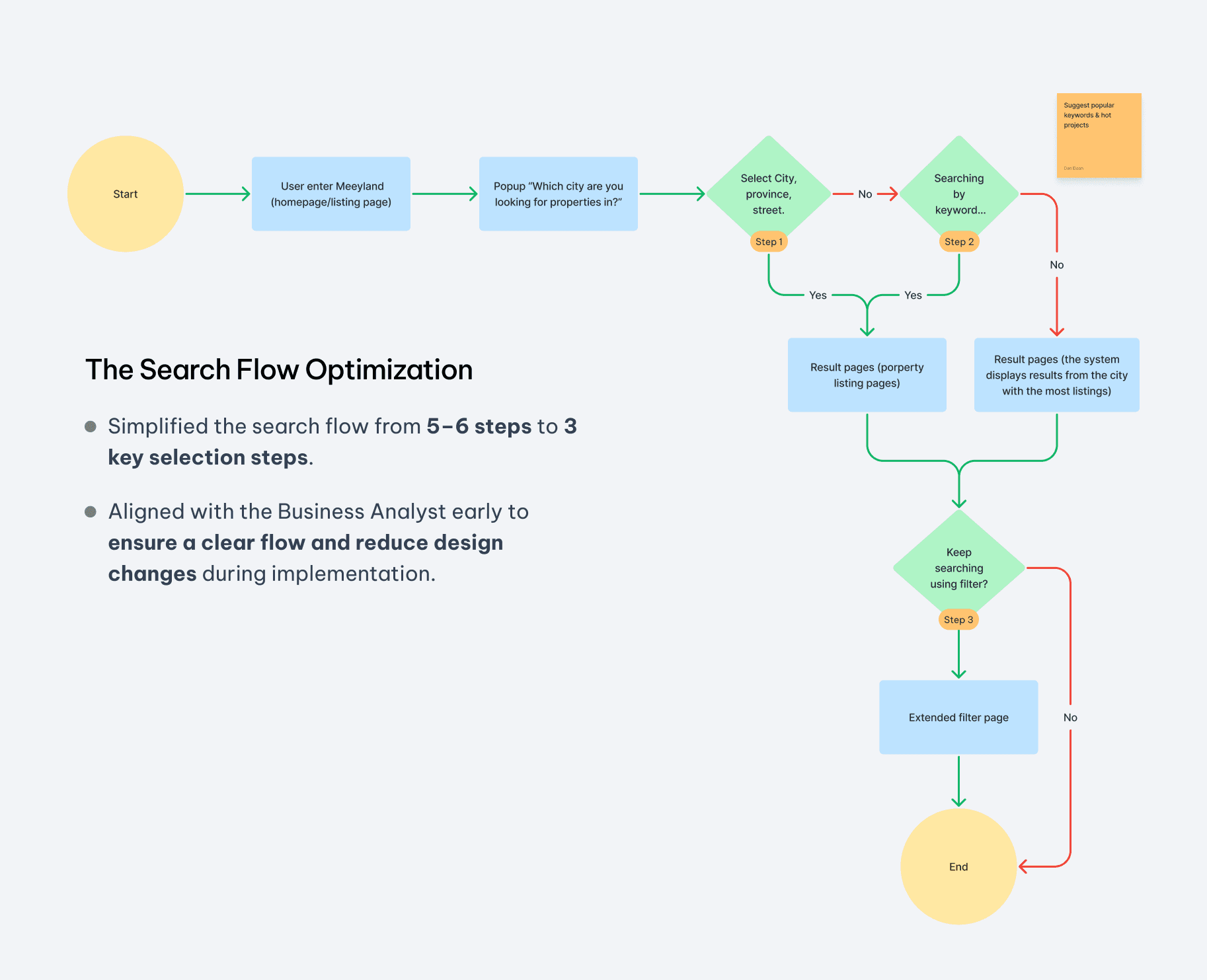
3.2 / Optimizing the Search Flow Based on Team-Voted Solutions
3.2 / Optimizing the Search Flow Based on Team-Voted Solutions
3.2 / Optimizing the Search Flow Based on Team-Voted Solutions
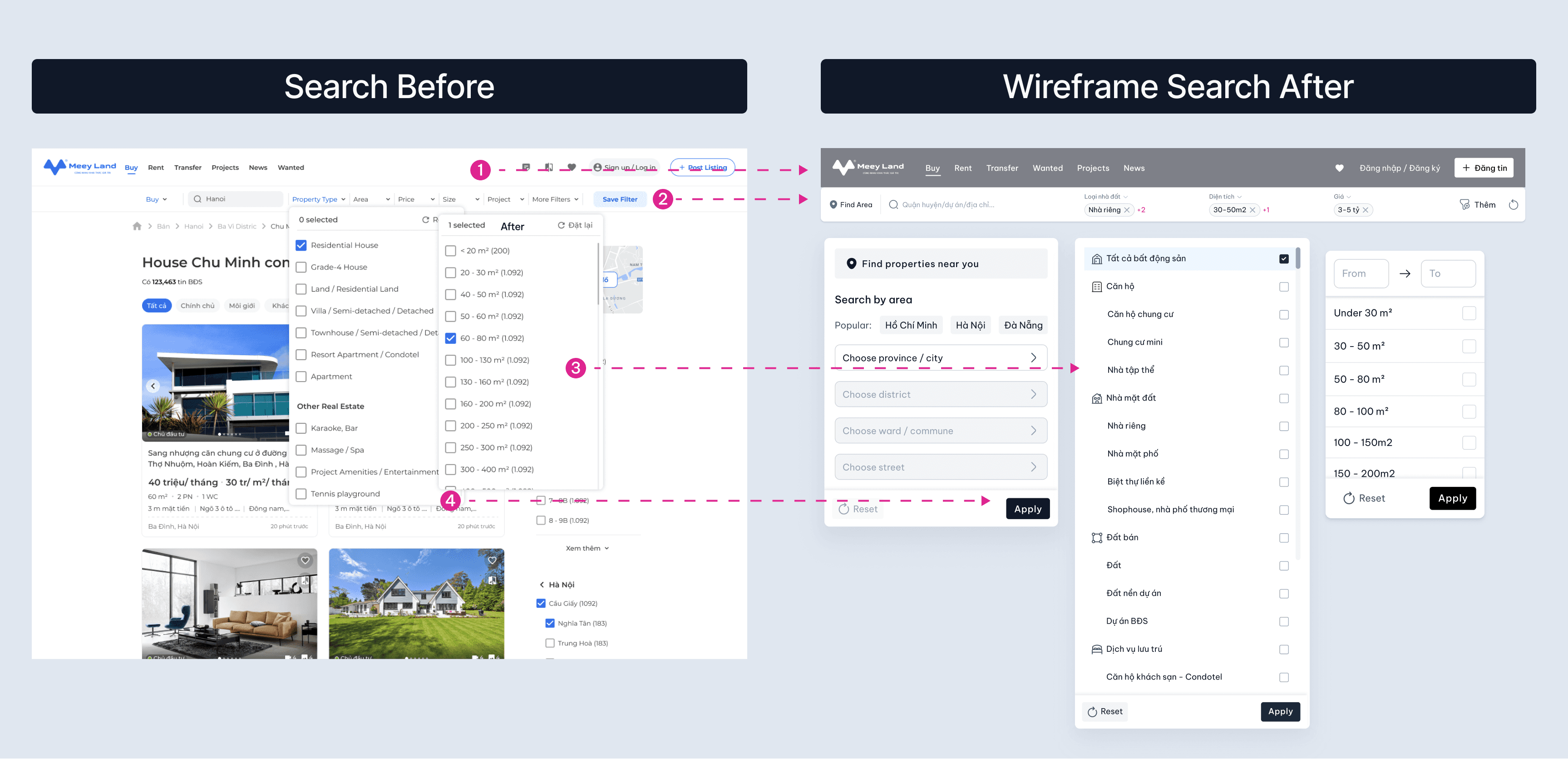
3.3 / Create Wireframe base on the new proposes
3.3 / Create Wireframe base on the new proposes
3.3 / Create Wireframe base on the new proposes
1
Improve Navigation Visibility
Adjust the UI of the navigation and search bar to increase contrast, improve hierarchy, and make key actions easier to find.
4
Add a Clear Action Button
Add a clear Apply button to help users review and confirm their filter selections before applying changes.
1
Improve Navigation Visibility
Adjust the UI of the navigation and search bar to increase contrast, improve hierarchy, and make key actions easier to find.
4
Add a Clear Action Button
Add a clear Apply button to help users review and confirm their filter selections before applying changes.
1
Improve Navigation Visibility
Adjust the UI of the navigation and search bar to increase contrast, improve hierarchy, and make key actions easier to find.
4
Add a Clear Action Button
Add a clear Apply button to help users review and confirm their filter selections before applying changes.
2
Simplify the Search Bar
Reduce the search bar from 7 filter fields to 5 core fields: location, property type, price, area, and project.
Move secondary filters into More Filters to reduce clutter and improve scannability.
3
Reduce Information Density in Key Filters
Simplify the property type filter and add icons to improve quick scanning.
Reduce price and area options from over 30 choices to 10 preset ranges, while still allowing custom input.
2
Simplify the Search Bar
Reduce the search bar from 7 filter fields to 5 core fields: location, property type, price, area, and project.
Move secondary filters into More Filters to reduce clutter and improve scannability.
3
Reduce Information Density in Key Filters
Simplify the property type filter and add icons to improve quick scanning.
Reduce price and area options from over 30 choices to 10 preset ranges, while still allowing custom input.
2
Simplify the Search Bar
Reduce the search bar from 7 filter fields to 5 core fields: location, property type, price, area, and project.
Move secondary filters into More Filters to reduce clutter and improve scannability.
3
Reduce Information Density in Key Filters
Simplify the property type filter and add icons to improve quick scanning.
Reduce price and area options from over 30 choices to 10 preset ranges, while still allowing custom input.

1
Prioritize Listings by Package Tier
Prioritize Listings by Package Tier
Paid listing packages can include 3D tours and receive higher placement in the listing feed to support business goals.
Paid listing packages can include 3D tours and receive higher placement in the listing feed to support business goals.
3
Use Icons and Tags for Key Information
Use Icons and Tags for Key Information
Important details such as location, area, and number of bedrooms are supported with icons to improve readability and quick scanning.
Important details such as location, area, and number of bedrooms are supported with icons to improve readability and quick scanning.
2
Add a Listing Quality Score
Add a Listing Quality Score
Listings with complete information, verified locations, and key details receive higher scores and better visibility.
This helps users access higher-quality and more reliable listings.
Listings with complete information, verified locations, and key details receive higher scores and better visibility.
This helps users access higher-quality and more reliable listings.
4
Build a Broker Credibility System
Build a Broker Credibility System
Trusted brokers with certificates and long-term activity are highlighted to help them build personal credibility.
This helps users identify more reliable sellers and brokers.
Trusted brokers with certificates and long-term activity are highlighted to help them build personal credibility.
This helps users identify more reliable sellers and brokers.
3.4 / Solution 1: Location-first Search
3.4 / Solution 1: Location-first Search
3.4 / Solution 1: Location-first Search
Previous issue: Users could select multiple cities at once, causing fragmented and less relevant results.
Previous issue: Users could select multiple cities at once, causing fragmented and less relevant results.
Solution: Prioritized location-based search and introduced clearer rules for selecting areas.
Solution: Prioritized location-based search and introduced clearer rules for selecting areas.

1
Keep “Find properties near you” as the first suggestion when location access is not granted.
Keep “Find properties near you” as the first suggestion when location access is not granted.
2
Require users to select a province/city before choosing districts or projects.
Require users to select a province/city before choosing districts or projects.
3
Limit each search to 1 province/city and up to 3 districts to keep results focused.
Limit each search to 1 province/city and up to 3 districts to keep results focused.
4
Add clear tooltips and an Apply button to help users understand constraints and make more precise decisions.
Add clear tooltips and an Apply button to help users understand constraints and make more precise decisions.
3.5 / Solution 2: Simplifying Key Filters
3.5 / Solution 2: Simplifying Key Filters
3.5 / Solution 2: Simplifying Key Filters

Previous issue: Key filters had long option lists, and checkbox-based selection made the filtering process time-consuming.
Solution:
1/ Added sliders for price and area ranges, making range selection easier and more flexible.
2/ Simplified filter options and used radio buttons for single-choice selections to keep the search more focused.
3/ Added a clear Apply button so users could easily confirm their filter choices.
Previous issue: Key filters had long option lists, and checkbox-based selection made the filtering process time-consuming.
Solution:
1/ Added sliders for price and area ranges, making range selection easier and more flexible.
2/ Simplified filter options and used radio buttons for single-choice selections to keep the search more focused.
3/ Added a clear Apply button so users could easily confirm their filter choices.
Previous issue: Many projects shared the same name across different regions, which caused confusion.
Solution: Added location details and listing counts under each project name to help users distinguish similar projects across different areas.
Previous issue: Many projects shared the same name across different regions, which caused confusion.
Solution: Added location details and listing counts under each project name to help users distinguish similar projects across different areas.

3.6 / Challenges & Final Decision
3.6 / Challenges & Final Decision
3.6 / Challenges & Final Decision
Project Challenges
Project Challenges
Project Challenges
However, we later identified several major issues in the location selection flow:
However, we later identified several major issues in the location selection flow:
01/ Location Data Conflicts
01/ Location Data Conflicts
Some streets belonged to multiple districts or wards, making the filtering logic difficult to control.
Some streets belonged to multiple districts or wards, making the filtering logic difficult to control.
02/ Complex User Experience
02/ Complex User Experience
The location flow still felt too complex, so we simplified the experience and focused on province/city selection first.
The location flow still felt too complex, so we simplified the experience and focused on province/city selection first.
• Highlighted the search bar and top menu.
• Simplified key filters.
• Reduced unnecessary clicks.
• Moved secondary options into More Filters.
• Highlighted the search bar and top menu.
• Simplified key filters.
• Reduced unnecessary clicks.
• Moved secondary options into More Filters.
• Added 3D tours to property listings.
• Redesigned listing cards to make key details such as price, area, and bedrooms more prominent.
• Introduced broker labels to distinguish trusted, experienced, and regular brokers.
• Added 3D tours to property listings.
• Redesigned listing cards to make key details such as price, area, and bedrooms more prominent.
• Introduced broker labels to distinguish trusted, experienced, and regular brokers.
The final decision
The final decision
The final decision
4 / Validate the outcome
4 / Validate the outcome
4 / Validate the outcome
Method: User interview
Method: User interview
Method: User interview
Participants: 10 users
Method: In-office sessions and remote testing via video call
Objective: Assess task completion time, ease of use, effectiveness, and user satisfaction with the new search features
Participants: 10 users
Method: In-office sessions and remote testing via video call
Objective: Assess task completion time, ease of use, effectiveness, and user satisfaction with the new search features
Key findings
Key findings
Key findings
12%
12%
is the average time on task reduced compared to the old version.
is the average time on task reduced compared to the old version.
100%
100%
of users completed tasks vs. 80% in the previous version
of users completed tasks vs. 80% in the previous version
13 mins
13 mins
average visit duration, up 115%
from approximately 5 mins before.
average visit duration, up 115%
from approximately 5 mins before.
15%
15%
Bounce rate was reduced compare to previous version
Bounce rate was reduced compare to previous version
80%
80%
of users expressed satisfaction with the search results
of users expressed satisfaction with the search results

5 / Retrospective: From Complexity to Clarity
5 / Retrospective: From Complexity to Clarity
5 / Retrospective:
From Complexity to Clarity
What was difficult
What was difficult
What was difficult
Improving search was not just a UI challenge. It required clarifying logic, restructuring information architecture, and helping users make decisions faster without feeling overwhelmed by too many choices.
Improving search was not just a UI challenge. It required clarifying logic, restructuring information architecture, and helping users make decisions faster without feeling overwhelmed by too many choices.
Improving search was not just a UI challenge. It required clarifying logic, restructuring information architecture, and helping users make decisions faster without feeling overwhelmed by too many choices.
What we changed
What we changed
What we changed
We combined research, heuristic evaluation, and workshops to simplify the flow. The solution introduced clearer location rules, shorter filters, focused results, and moved secondary actions into More Filters.
We combined research, heuristic evaluation, and workshops to simplify the flow. The solution introduced clearer location rules, shorter filters, focused results, and moved secondary actions into More Filters.
What I learned
What I learned
What I learned
I learned to balance user needs with system constraints. Instead of adding more options, we reduced complexity, prioritized key decisions, and made the search experience easier to understand.
I learned to balance user needs with system constraints. Instead of adding more options, we reduced complexity, prioritized key decisions, and made the search experience easier to understand.
6/ What’s next
6/ What’s next
6/ What’s next
The next step is to make the property detail experience more informative and engaging. I would explore features such as local price comparison, area reviews, neighborhood insights, and market references to help users evaluate properties with more confidence and spend more time exploring relevant information on the platform.
Beyond the buyer experience, I would also expand the product to support Real Estate Brokers by building a personal broker profile page. This profile could include verified certificates, professional information, active listings, videos, and credibility signals, helping brokers build their personal brand and establish trust with potential customers.
The next step is to make the property detail experience more informative and engaging. I would explore features such as local price comparison, area reviews, neighborhood insights, and market references to help users evaluate properties with more confidence and spend more time exploring relevant information on the platform.
Beyond the buyer experience, I would also expand the product to support Real Estate Brokers by building a personal broker profile page. This profile could include verified certificates, professional information, active listings, videos, and credibility signals, helping brokers build their personal brand and establish trust with potential customers.
Previous Project
Previous Project
Previous Project
Next Project
Next Project
Next Project
Get in Touch
Let’s Connect
Quick contact
my CV

Get in Touch
Let’s Connect
Quick contact
my CV
Get in Touch
Let’s Connect
Quick contact
my CV